Showing posts with label visual communications. Show all posts

Wednesday, December 08, 2010

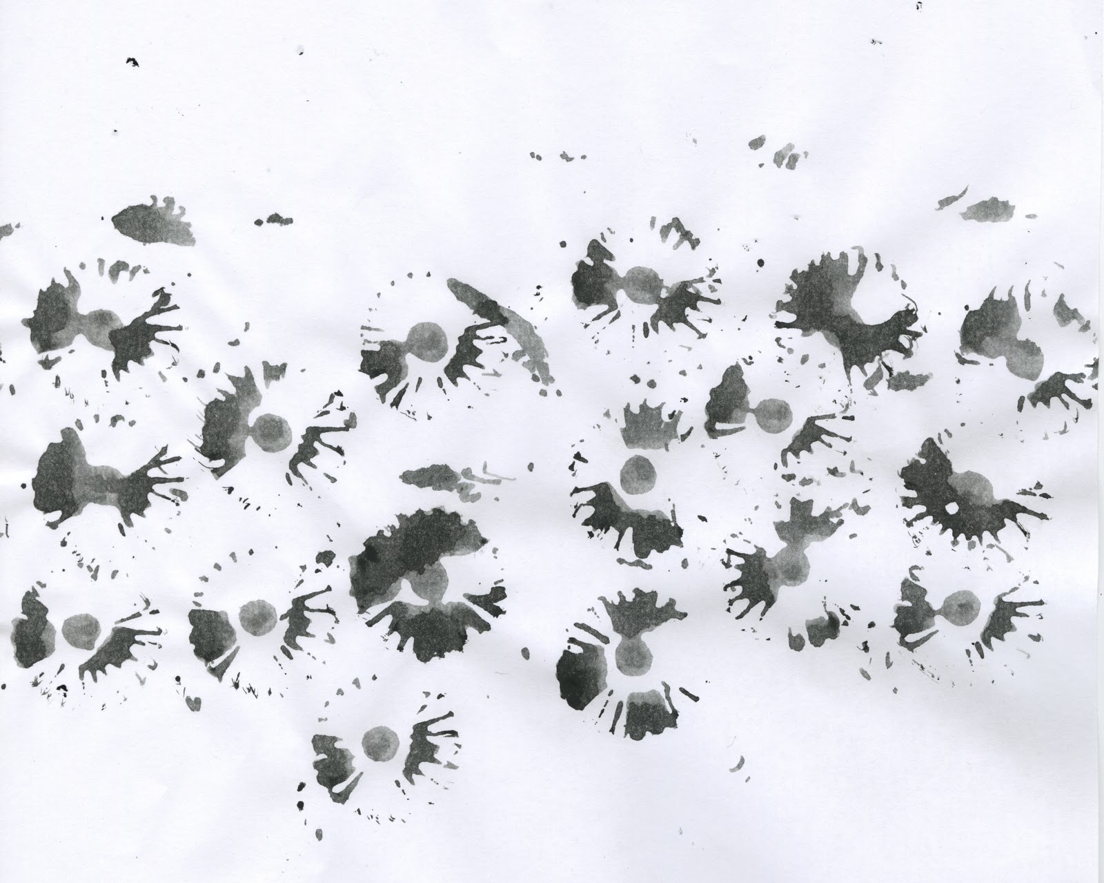
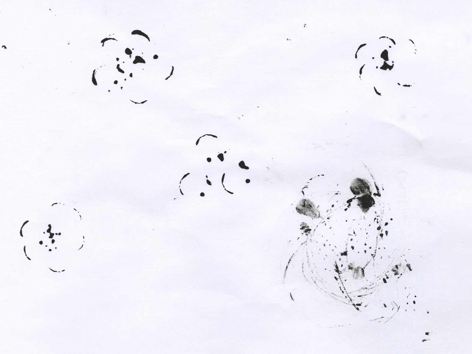
Marks!


Feathers


Fishbones


Flowers


 Storyboard Sketches


motif sketches


Final Storyboard

Semester Reflection

This past semester has definitely been one of discovery and exploration. With each project I was able to learn about the fundamentals of design along with exploring not only who I am now as a designer, but also get a more clearer depiction of who i will become as a designer in the future.

One of the greater lessons that I have become aware of and has been carried out through each of our projects is that you have to be sure of what it is that you are trying to communicate. In my experience, it seems that if there is no certainty in my initial concept then every formal decision I make becomes more and more unstable or difficult to reach. Having a clear, concise direction makes every formal and conceptual decision that much more seamless.

As mentioned in a previous post I have recognized a few consistencies in my process that are somewhat inconvenient. I have the tendency to let my frustrations interfere with my performance and let it hinder the development of the project I am working on. I know that this awareness is something that I will carry with me for the rest of my time here at KCAI and will stay aware of through out my future in design. Becoming more familiar with the way my brain and body operate is one of the best things to figure out. When you are in formed on how you function then you know how to plan your process accordingly. Of course as designers we aren't always allowed the luxury of a comfortable amount of time to work on an assignment or job, but if we are aware of our own personal process then we are more likely to tailor our creative process into any set parameters.

Final Statement

 Project 3 was all about translating and exploring the relationship of concept and form. In the animating process, the goal was to enhance the haiku so that it spoke of its content with the powerful addition of motion. I feel that although I had some struggle with the creation of the animation itself, I was able to create a connection between the content of my haiku and the transitions I used, along with the music I chose. The taxonomy book portion of this project was quite a different feat. I enjoyed the fact that we had to create a digital translation of our motifs and a more tactile task, such as this book. I found it invigorating to creates  a system that reflects the beauty of the haiku but also has its own identity.

Past Project Critique

This poster was one of my initial iterations of union station. I pushed further and wound up with another iteration of this poster, but this one in particular has a very different approach. The reason it is not as successful as my other posters is because it lacks a sense of the place I was trying to embody. This poster is very static, and this is not appropriate for Union Station, a place which is all about movement and interaction. It is apparent that sometimes I forget to think about the small details that tie a work together. I feel that this is the case here, in the sense that I lost the structure that builds Union Station.


Monday, December 06, 2010

Responding late... but responding none the less

Paul Rand is a designer best known for his logos. His view is the idea that content and form should relate equally and communicate as one unit. each of these elements rely on each other to be successful. It's all about balance and proper proportions. I relate this idea to when we were actually making our motifs. I know that I struggled to communicate the content through the form, mostly because I for some reason, found myself working backwards. I was creating marks and then applying content to them, which is not wrong, but in this particular project it was important to determine content before introducing mark making. By having a clear direction before actually creating marks, the balance between content and form will be much more balanced.

Stephan Bucher is a graphic designer and illustrator, among many other things.  In this video you get a closer look at how he creates these little monsters of his. The second I saw him lay the ink down on the paper and use air to manipulate the initial mark immediately spoke of the motifs we were creating. Bucher displays such a level of meaning behind the content of his monsters but does not force the mark to mean any thing other than what comes to him instantaneously. When the clip of how he animates these creatures plays, i thought of our own translation of our motifs. The monsters he creates already have that movement, they already have that sense of action, and by transforming them into an animation these qualities are only enhanced, not forced. I feel like this is the lesson that was mentioned during our final critique with our guest critique.

A little more wisdom...

This blog post could have come a bit sooner, but I have been submerged in school work for this post to finally make its appearance. After my final critique with Marty and my fellow designers I couldn't help but feel disappointed. More so with myself and the way I came about the final product. As Marty mentioned, I tend to let my frustrations get the best of me and allow myself to get stuck into one idea, this then leads to me settling with an idea or design that I am not 100% happy with. She noticed that this happened in our last typography assignment, particularly with my spreads. I was frustrated because I could not find a solution that I was happy with. Although it took me until the day before it was due to finally find a layout I was proud of, eventually, I did find a solution. This exact situation repeated itself while designing my final poster, but unlike the last project, I was not able to find that "aha!" moment (you know the moment that the minute you move a block of text two inches to the right and instantly you know you've made the right formal decision) before final critique.

After some time to think about this situation I realized that a moment of this exact kind of frustration has happened in every assignment. It happened in my mark making assignment with Jamie, where i was so frustrated that I could not see a thing other than what was in front of me. It took Jamie having to literally put a pen in my hand and open my sketch book to freshen up my approach. I mind mapped some more and it worked. I left my rut behind. Yes, this happened recently in viscom but it even happened all the way back when we were working on our dot book. I remember that I, at last minute, completely changed a typographic composition and it was a very good decision. It completely changed how it affected my book as a whole. Upon reflecting on this matter, it seems that if this is the way i operate, and this situation keeps repeating itself, then I need to work around it so that in future assignments I catch this frustration in time and can work through it on my own so that I can present a final product that I am proud of. A piece of information that I will apply to my work next semester.

Wednesday, November 17, 2010

Final Motifs + Type

After many, many iterations and times of doubt I have landed at my final motifs!


Sunday, November 14, 2010

Taxonomy Ideas

The haiku: 
Must spring time fade?
Then cry all the birds and fishes
Cold pale eyes pour tears
 
The Classification Options:
Nature vs. Animal
Flora vs. Fauna (what we're leaning towards)
Sky vs. Ocean

The Sub Categories:
gradients and density
mark making method: stamp/pressing vs. dragging/rotating

The Tools:
fish bones
flowers
leaves
grass
sticks
feathers
wood
small bird

The Book:
6x9 saddle stitch
6x12 saddle stitch

The Format:
One mark per page
Create a contact sheet

Reworking A Specific Motif

Haiku:
Must spring time fade?
Then cry all the birds and fishes
Cold pale eyes pour tears

Must spring time fade?

 
Cold pale eyes pour tears

I have my three final marks pinned down and ready to go, however, I am not completely satisfied with motif #2. I've created a new motif to go with this line that i feel better about, but I would like some additional feedback.


The line is: Then cry all the birds and fishes


Approved mark
New Marks


Wednesday, October 27, 2010

Project Two Final Deliverables

Activating and Arranging Graphic Space:
Activating and arranging the space effectively differed for each poster. The poster that encompassed Union Station was meant to portray the movement of such a facility. Union Station is a place of movement and a feeling of bustling throughout its' grand halls. In the poster of Downtown, I wanted to pay homage to the geometric buildings that inhabit Downtown. Clean, crisp lines that, even though are horizontal, draw the eye vertically, much like the skyscrapers of downtown. The poster of Penn Valley Park has a very different feel than that of Union Station and Downtown. I wanted to emphasize the fluidity and flexibility of the lines that create the skate park. Again, this poster emphasizes the movement of Penn valley Park, but it is not the same kind of movement that is encompassed by the other two posters. The kind of movement I was aiming for in the Penn Valley Poster has a bit more grace than that if the other two posters.

Formal/Conceptual Juxtaposition:
The juxtapositions allow the rhythm of each different place to be seen visually. We all have connotations to every different place and the juxtapositions allow my personal opinion to shine through. The line study for Union Station is complex and random, much like the unpredictability that comes with traveling. The juxtaposition for Penn Valley Park demonstrates the therapeutic swaying of skating. The idea is to have the viewers eye skate from line to line. The pairing of Downtown offers the visual quality of structure. Downtown has such an orderly structure that is, at the same time, random because no two buildings are alike.

Communicating Visual Identity of a Location:
The visual identity of each location is captured by the visual movement. How the eye reacts the instant it absorbs an image is what is imprinted in the viewers mind. This is why I felt it was important to capture the essence of each location by creating compositions that reflected each and every different style. Downtown has this cold sense of structure that extends far beyond the natural eyeline. A person must look up to the sky at a mass of concrete that surpasses what the eye can see. The extension of vertical lines hints that downtown is filled with skyscrapers that require the viewer to extend their eyeline upward. Union Station has this feeling of constant movement. This is because no one stays at Union Station for too long. Those traveling do not stay at Union Station, they only use it as a means to get somewhere else. This is reflected in the line study of my composition. No line ever goes on for too long, nor does it have a consistent pattern. Each line and image has it's own rhythm, but they all work together to create a united feeling; a feeling that even though they are moving at different speeds and in different directions, they are all moving together. My composition of Penn Valley Park speaks of what the act of swaying and following a fluid, smooth course feels like. By creating such fluid lines I want to viewer to think of the swift, continuous movement and the sound that a skateboard makes when flowing on top of the concrete.

Employing tools and incremental process:
Like in all of our assignments, the process was much more important than the final product. This process in particular was about exercising every possibility and deciding what worked best. This assignment reinforced the idea that no one iteration is perfect; there is always room for improvement. This project allowed me to exercise my judgment in deciding when to call something done. The tools I used most were my peers and Jamie. I asked for a lot of different opinions of my posters because when I work on something for an extended period of time my vision becomes skewed. I no longer see clearly, which is why it is important to gain or regain perspective through fellow designers.

Final Six Parings


Line Study Evolution


For the evolution of my line study I've chosen to demonstrate how my Penn Vally Park poster came to be. This poster was derived from a basic line study that was then manipulated on the scanner, then refined in illustrator, then placed into my composition.