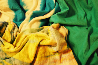
This exercise has definitely helped me remember the different harmonies. Also, it's amazing how different the pms colors print out so differently than RGB or CMYK.

A couple of my Photo Color Studies thus far...

I am pleased with these images, but they strike me as...boring? With all the variety of fabrics that there are in the world, I feel like these photos are lackluster. I think I need to bring in some sequins or some tule or some spandex. Maybe latex? sdcnwobvwkenwidkmybffjill


No comments:
Post a Comment